Personal Branding: Year 10 + ‘Special Characters’
This year, I celebrated 10 years since I graduated from college and began working as a professional designer/Creative. I’m shooketh at how quickly that time went by but also…damn I’ve been at it for a while! It feels fitting that I’d give my personal brand some love and attention to help usher me into whatever my new era is going to be. Can’t go into the next 10 not presenting my latest and greatest right?
My last full personal brand overhaul was in 2015. At the time, it felt like such a good depiction of where I was at in my career. It was simple and built to grow with me as I planned to leave my first job and hopefully land an agency role. I ultimately went through a hell of a run on the job front with that “safe” site that I tweaked and updated the contents of over the years. In this new phase, it was time for me to move past safe into showing my fullest and truest self in the look + feel along with the curation of projects chosen as case studies.
1. Referencing Yourself
One of my favorite things about Beyonce’s entire Renaissance era is the intentional commitment to referencing previous era’s of her 26 year old career. There’s something especially fly about being great for so long that you can dip into your past for ideas that are still impactful today. Her team did that so well and the concert film only enhanced my fascination with how deep they went into the past to present this new future.
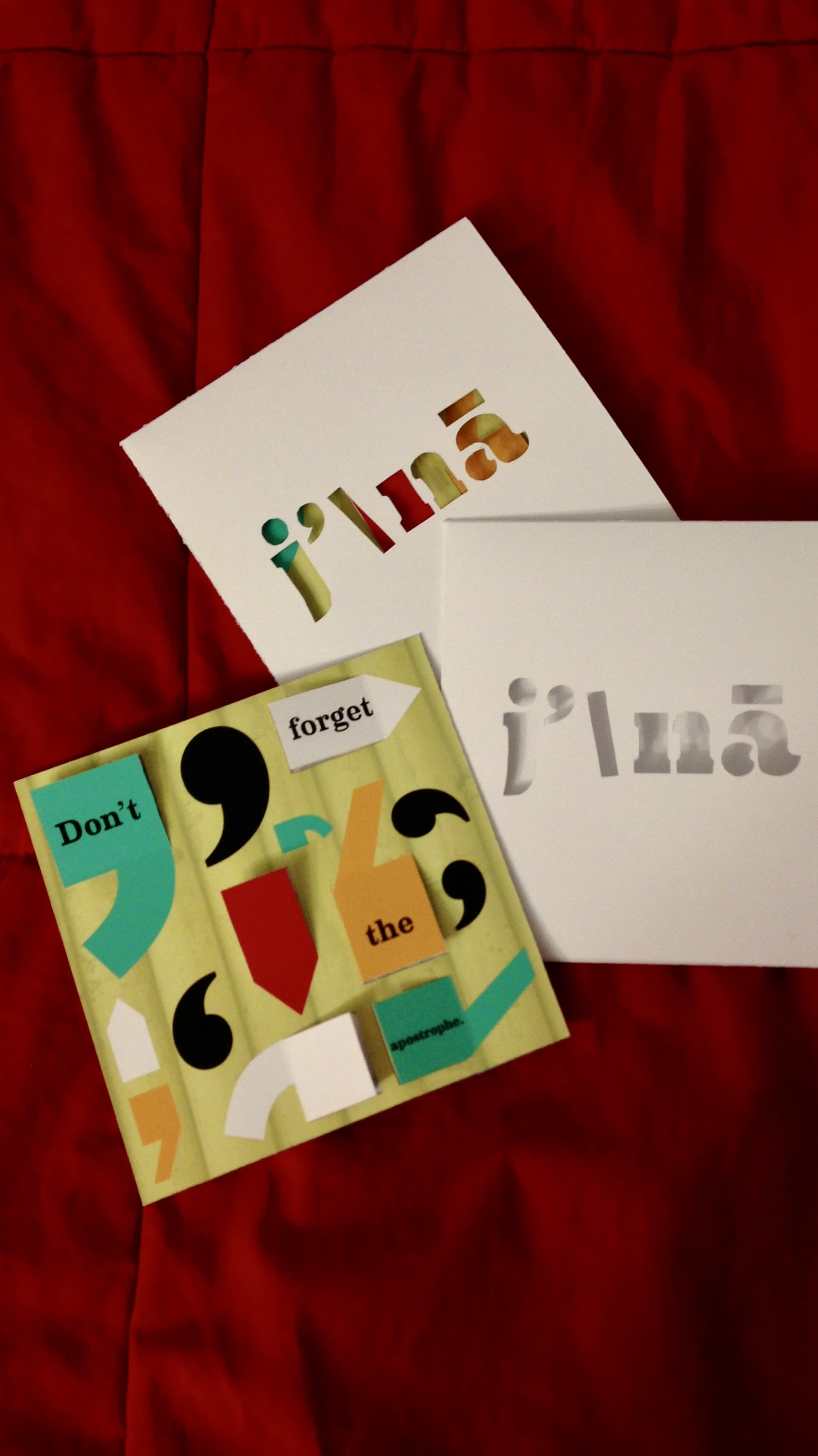
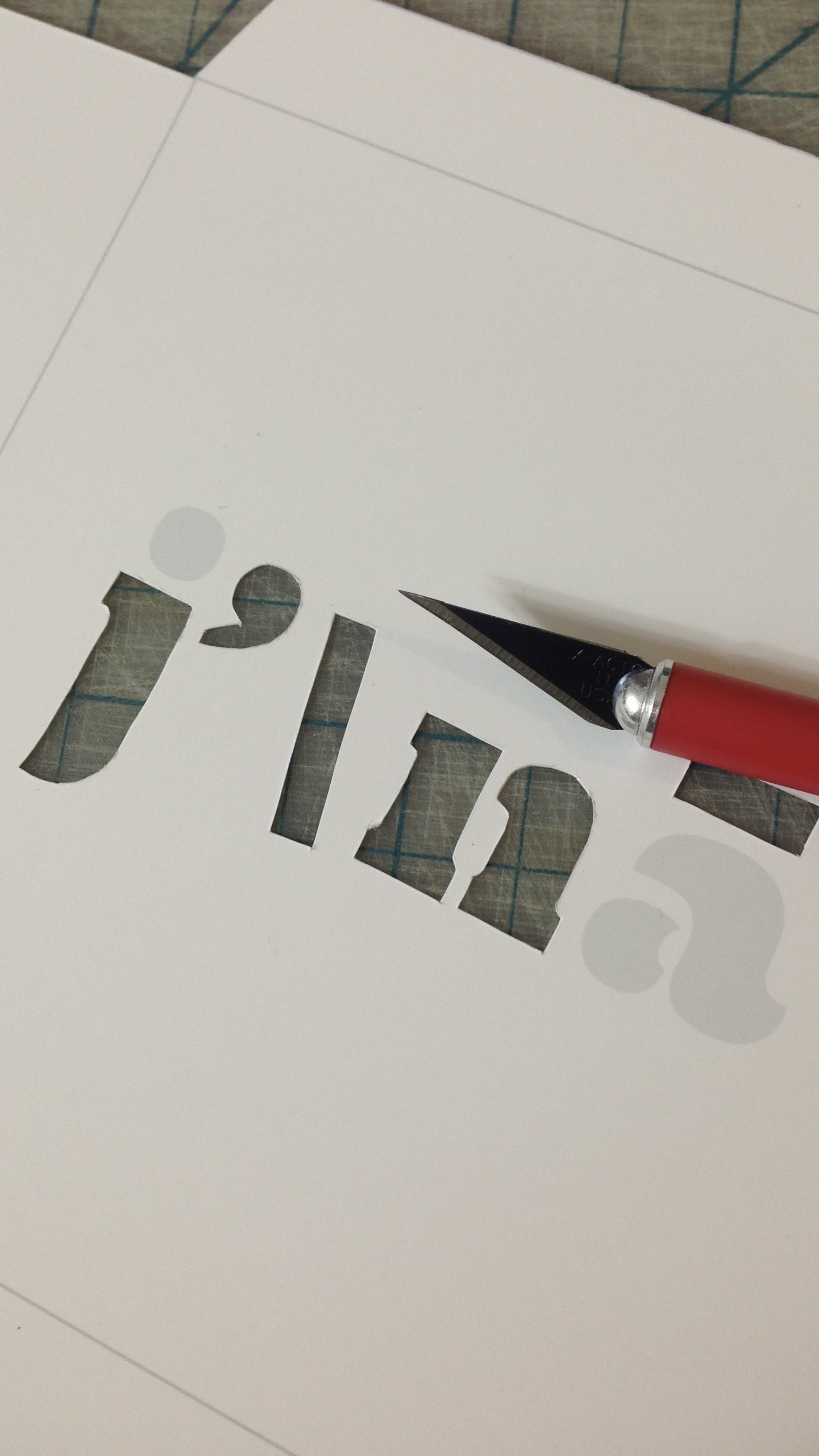
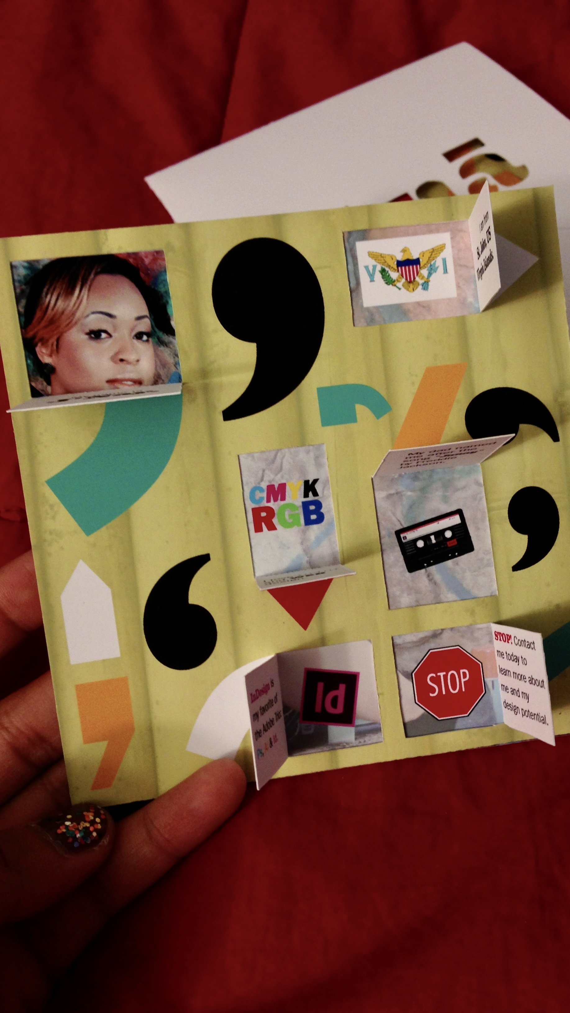
At the core of my new personal brand is a pivot back to the concept used for my self promo piece during the spring semester of my senior year of college. The entire piece is centered around accurately pronouncing my name and using the apostrophe in my first name as a vessel to reveal things about me as a designer. Handmade with the $200 printer in my apartment, bone folder and many x-acto knife blades later, the "Don't Forget the Apostrophe” concept was brought to life.
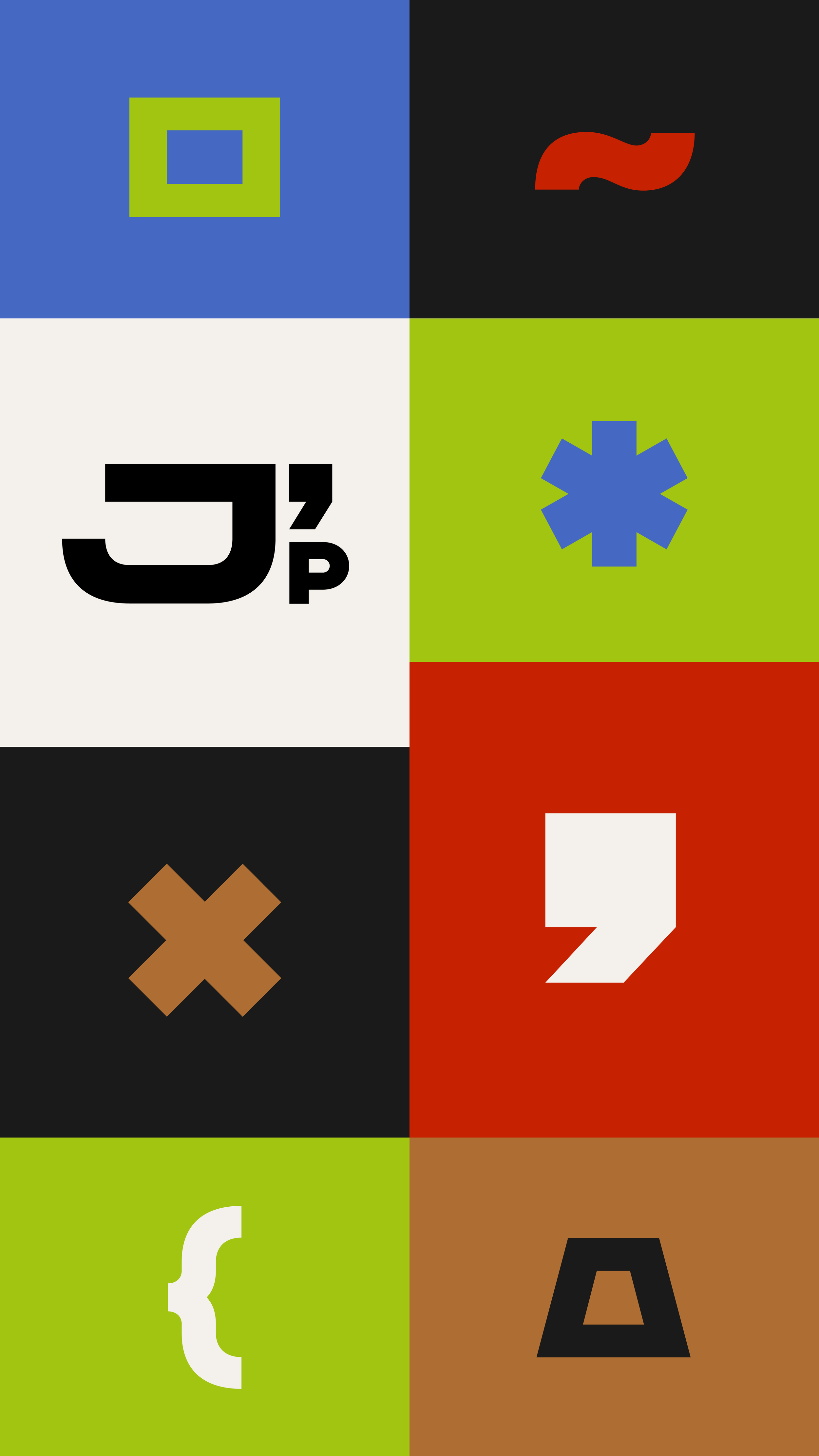
I took stock of the best parts of that piece and used it as a base for the new brand I set out to build. Many of those elements show up in the color palette, how apostrophe’s are utilized in the two logomarks and much more.
2. “Get It Right + Spell It Right” — Norma Pickard-Samuel

My Dad got my name from a Freddie Jackson song and always maintained that his daughter would be named as such. Once I arrived, my aunt, who happens to be a career Kindergarten teacher, came up with the unique spelling. For all its uniqueness, it’s quite literally pronounced as written but has still caused me all sorts of random and deliberate (more on that shortly!) problems.
“Don’t Forget the Apostrophe” felt like the right language for my self promo 10 years ago. It’s a sentiment that is relevant today where algorithms by design still don’t consider it legitimate in a name and jobs/coworkers/and clients sometimes struggle to make the effort to include it and honor my name as written. Honoring the special character in my name continues to feel like a necessity while honoring my commitment to never playing small again.
For that reason, the hardest part of beginning to rebrand was finding a font that fit the energy that best aligned with me. More importantly, it had to have the PERFECT apostrophe, duh! I went through so many... like... it’s unreal how much time I spent searching. All that to still modify it slightly for two of the marks, lol. I supposed that’s the “get it right” part of Norma’s quote. 😌

3. 10 Years in the Field
I cannot believe I’ve been doing this work professionally for 10 years and that I’ve been in DC just as long.
I wish I could say it was always rosey but it’s been such a hard fought 10 years. I clamored towards every job, every win, every seat at the table and sometimes it felt so fruitless in the end. I experienced so many -isms that directly informed how I was regarded and rewarded at places I gave all of my energy to. With that said, I am so proud of the woman I’ve become in these 10 years. Of the manager/design leader I’ve poured so much energy into showing up as for my teams and the work I’ve been fortunate to do.
That reminder was super clear as I began crafting the list of case studies for the new site. There were way more viable projects I could have included and each one told a story of lessons learned, collaborations that produced pure magic and management journeys that took so much out of me to see through but we pushed through anyway.
These 10 years have changed my life and I am really proud of how that was realized in my new visual presence across all of my online properties.
4. Creative Homes + New JNAYPENN.COM
Sure the new JNAYPENN.COM is about where I’ve been and what I’ve done but more than anything, it was built to communicate where I’m going. And if it’s up to me? Your girl is going places! I ended year 10 as a free agent poised to excel in many roles that exist and those that have yet to be created. So, let’s work. Allow me to reintroduce myself:
Important Career Links: JNAYPENN.COM | LinkedIn | hello@jnaypenn.com